


Unpacking Apple's Design Genius: Ecosystem, Simplicity, and the Magic
A deep dive into the philosophy, strategy, and execution behind Apple's seamless user experience.

There's a certain 'magic' often attributed to Apple products. Devices work together seamlessly, interfaces feel intuitive, and complex tasks often seem effortless. But this isn't magic – it's meticulous design and strategic integration. How does Apple achieve this cohesive experience across its vast ecosystem?
Let's unpack the genius behind Apple's approach, diving deep into the philosophy, challenges, strategy, and results that define one of the world's most powerful tech ecosystems.

The Guiding Philosophy: "Design is How It Works"
It arguably starts with a core belief, famously articulated by Steve Jobs:

"Design is not just what it looks like and feels like. Design is how it works."
This principle elevates design beyond mere aesthetics, focusing on functionality, usability, and the overall user experience. It's the foundation upon which Apple's ecosystem is built – the idea that true elegance lies in seamless operation.
The Growing Challenge: Complexity vs. Simplicity

This philosophy faced a massive hurdle, particularly from the early 2000s onwards. As Apple expanded its product line – from Macs and iPods to iPhones, iPads, Watches, AirPods, and more – the potential for complexity grew exponentially.
Apple had to navigate:
Multiple Devices: How do you make distinct products feel like part of a single family?
Complex Integrations: Ensuring seamless data flow, continuity, and communication between devices is a significant technical challenge.
Growing Feature Sets: Adding new capabilities without overwhelming the user.
User Expectations for Simplicity: The brand promise was built on ease-of-use, an expectation that only intensified with more powerful devices.
Managing this tension between capability and simplicity became a central strategic challenge.
The Approach: Embracing Minimalism

One key part of Apple's approach involved a significant shift in visual design philosophy. Many will remember the era of skeuomorphism, where digital interfaces mimicked real-world textures like leather, paper, or wood (think early versions of Notes or Books apps).
Around 2013 (with iOS 7), Apple pivoted dramatically towards flat design and minimalism. This wasn't just a visual trend; it marked a turning point:
Reduced Visual Clutter: Cleaner lines, simpler icons, and refined typography created a less distracting interface.
Focus on Content: Minimalism allowed the user's content and the core functionality to take center stage.
Unified Visual Language: A simpler aesthetic was easier to apply consistently across a growing range of devices and screen sizes, subtly reinforcing the ecosystem's unity.
This shift, clearly visible in the evolution of icons and apps like the Calculator, Notes, and Voice Memos over the years, was a deliberate move to simplify the visual experience.
The Core Strategy: Three Pillars of Integration
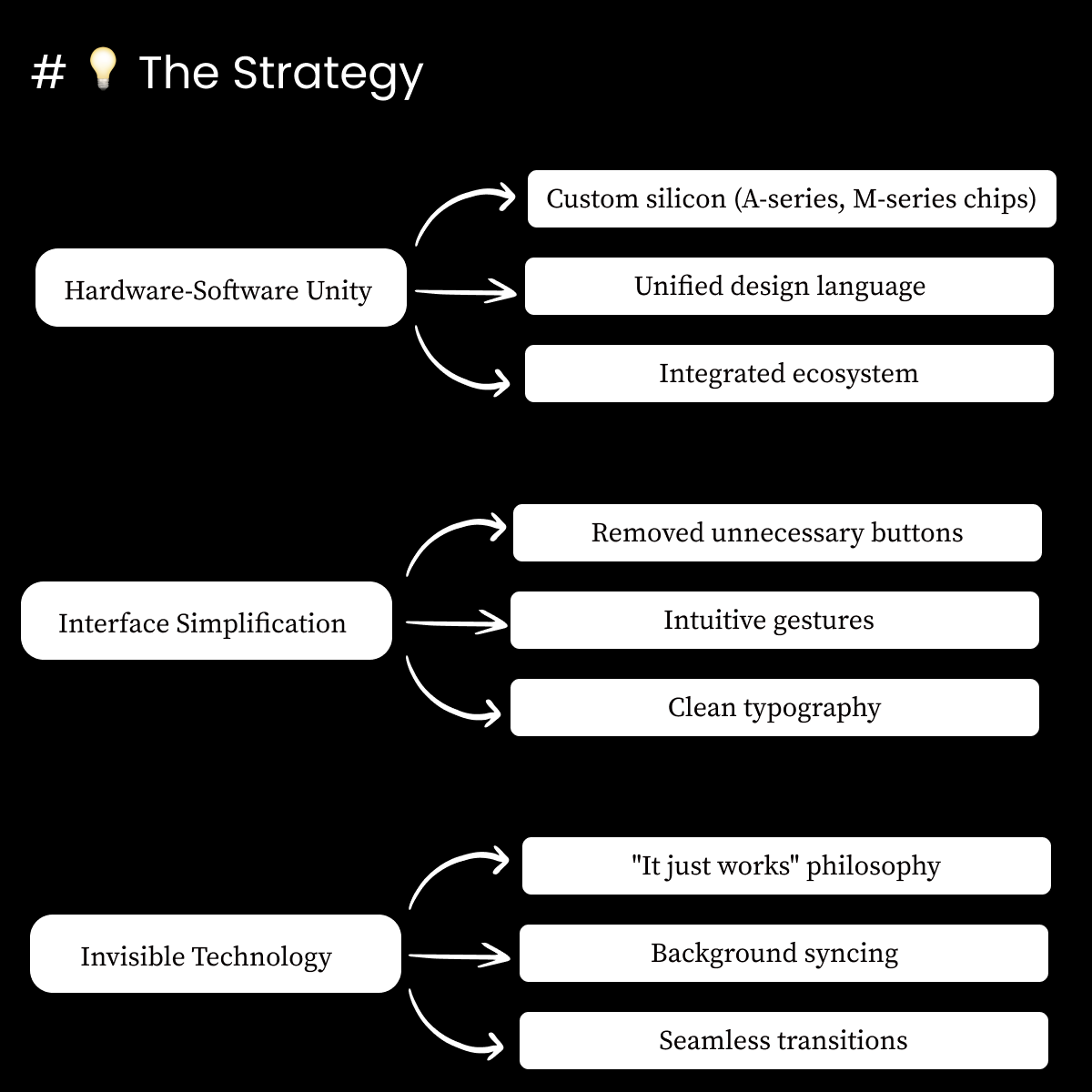
Simplifying the visuals was just one piece. The deeper strategy for managing the ecosystem rests on several interconnected pillars:
Hardware-Software Unity:
Custom Silicon: Designing their own chips (A-series, M-series) allows Apple unparalleled control over performance, efficiency, and enabling features that tightly integrate hardware and software.
Unified Design Language: Extending minimalist principles across both hardware and software creates consistency.
Integrated Ecosystem Focus: Prioritizing features (like Handoff, Universal Clipboard, Sidecar) that explicitly leverage multiple devices working together.
Interface Simplification:
Reducing Physical Complexity: Removing buttons (like the iPhone's home button) in favor of gestures.
Intuitive Interactions: Developing consistent and learnable gestures across devices.
Clean Typography & Layout: Prioritizing clarity and readability in the UI.
Invisible Technology:
"It Just Works" Philosophy: The ultimate goal – making complex processes happen seamlessly in the background.
Background Syncing: Effortless data synchronization via iCloud across devices.
Seamless Transitions: Features like automatic device switching for AirPods, where the underlying complexity is hidden from the user.
The Results: A Testament to the Strategy
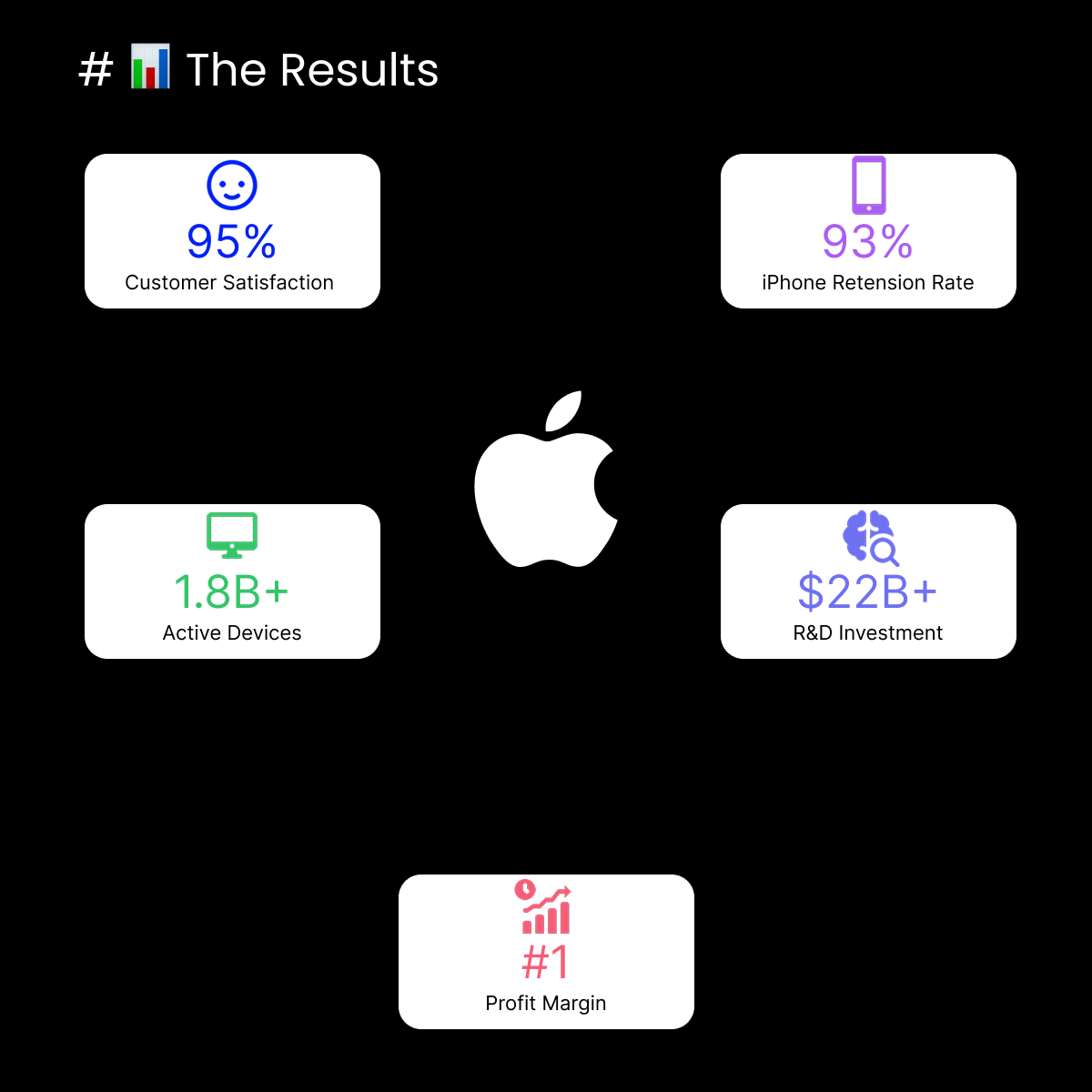
The success of this integrated approach is reflected in tangible results. While specific numbers fluctuate year to year, Apple consistently achieves:
Exceptional Customer Satisfaction: Users frequently report high levels of satisfaction, often attributed to ease-of-use and the ecosystem experience.
Remarkable Retention Rates: The seamless integration fosters strong loyalty, making users likely to stay within the Apple ecosystem.
Massive Scale: Billions of active devices worldwide demonstrate the reach and adoption of the platform.
Sustained R&D Investment: Continued significant investment in research and development fuels the next wave of integration and innovation.
Leading Business Performance: The strategy translates into strong market positioning and financial success, including industry-leading profit margins in key segments.
(Note: For the latest specific figures on metrics like active devices or satisfaction percentages, always refer to Apple's current official reports or reputable financial news sources.)
In Action: The AirPods Example
Consider the seemingly simple act of pairing AirPods for the first time:
What the User Sees: 1. Open the AirPods case near your iPhone. 2. Tap "Connect" on the pop-up screen. That's it.
What's Happening Behind the Scenes: Custom H1/H2 chips initiate communication, the iPhone instantly detects the nearby device, iCloud syncs the pairing information to your other compatible devices logged into the same account, enabling automatic switching later, while complex audio processing like Spatial Audio is managed seamlessly – all hidden beneath a two-step user action.
This perfectly illustrates how hardware, software, and services work in concert to deliver an experience that feels effortless, embodying the "Invisible Technology" principle.
Your Turn: Applying the Principles
Apple's journey offers valuable lessons for anyone involved in building products or services, especially product leaders. The relentless focus on user experience, the strategic integration of hardware and software, and the courage to simplify (even when it means removing features or familiar interactions) are key takeaways.
It prompts reflection:
How can the principles of minimalist design, focusing on core functionality, apply to your own products?
Where does unnecessary complexity hide in your user experience, and what technical or design investments could simplify it?
How do you navigate the constant tension between adding features and maintaining simplicity?
What are your thoughts on Apple's strategy, or how do these principles apply in your own context? Share your insights in the comments below!